Our WordPress plugin offers you a responsive comparison table. With this extension you can easily create a comparison for your affiliate products. In this article you will learn how to create such a table.
This feature is shown as an extension and can be downloaded under Add-Ons.
Then you can upload the ZIP file directly to WordPress as a plugin and install it. Do not forget to activate the extension under Licenses.
An automatic comparison table is already supplied. With this, a simple comparison can be made. Standard fields are displayed.
This shortcode generates the following table:
[atkp template='comparetable' ids=''][/atkp]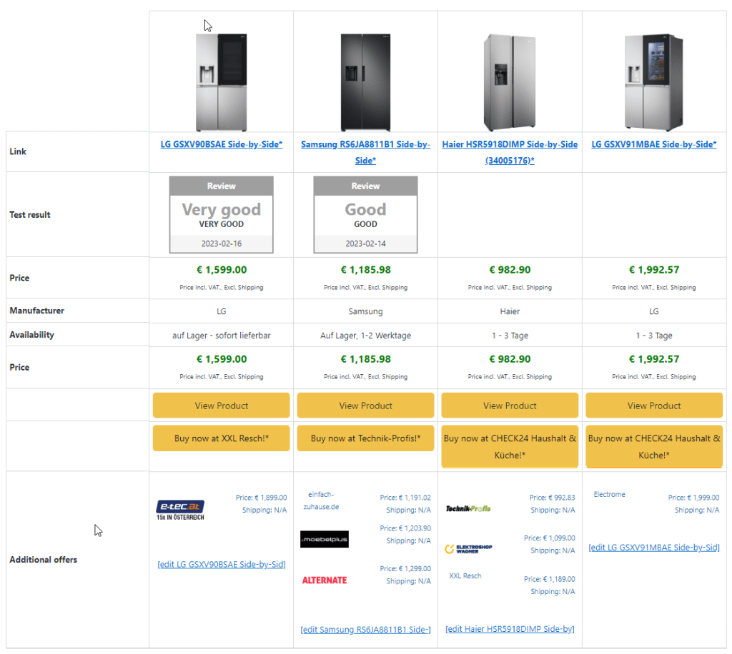
This table can be customized via the settings. To do this, go to Settings -> Comparison Table.
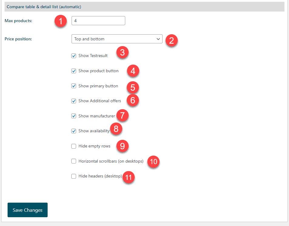
Here you can specify the maximum number of products that should appear next to each other. If the list contains more products than this number, they will simply not be displayed.
This allows you to control where the price can be displayed in the comparison table. By default, this is displayed at the top and bottom.
The test seal is the gray seal in the screenshot above with the test result.
This is the "View Product" button in the screenshot above.
The primary button usually leads to the product itself. But can also be configured to a different destination via the settings.
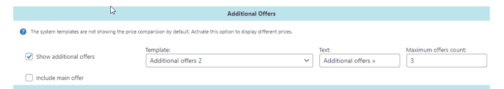
This is the last line in the comparison table. If the option is globally active, further offers are displayed here.
You can find these options in the display settings under "More offers":
Displays the manufacturer, if present.
Displays the availability, if the availability is available.
If you use user-defined field groups and the value of a row is empty for all products, this row is automatically hidden.
If you set the max. When the page width is reached, a scrollbar is automatically displayed.
This hides the column descriptions at the Destkop.
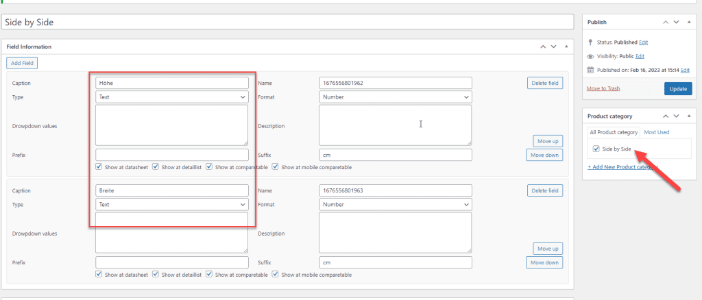
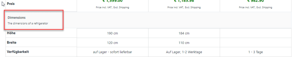
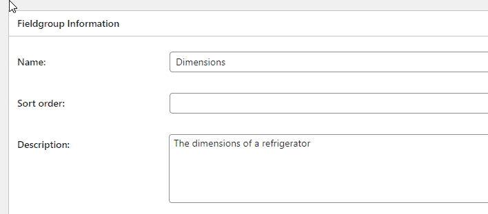
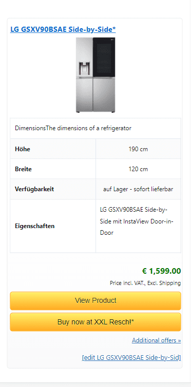
If you create your own fields in the field groups and link them to the products, you can also display these fields automatically.
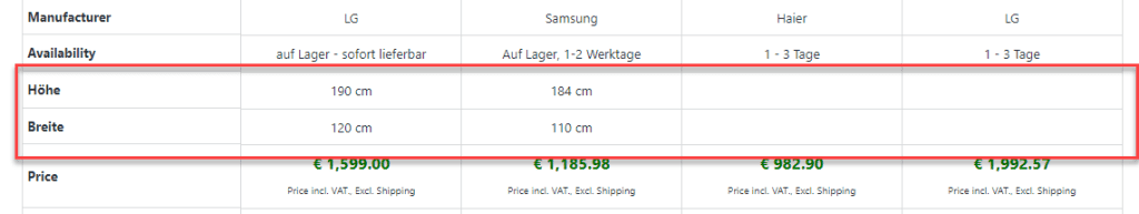
To do this, we simply created two fields here in the field group and then assigned them to the product category. If this product category is now also assigned to the product, the data can be entered in the fields at the product.
This data is then displayed in the comparison table:
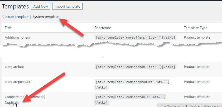
If you want more control over the comparison table, you can also create your own. Once you have installed the Responsive Comparison Table extension, you can duplicate the existing one in the system templates.
You will then be redirected to the new template. Here you now have a preview as well as countless setting options.
Important: This is only the template. No data is entered here.
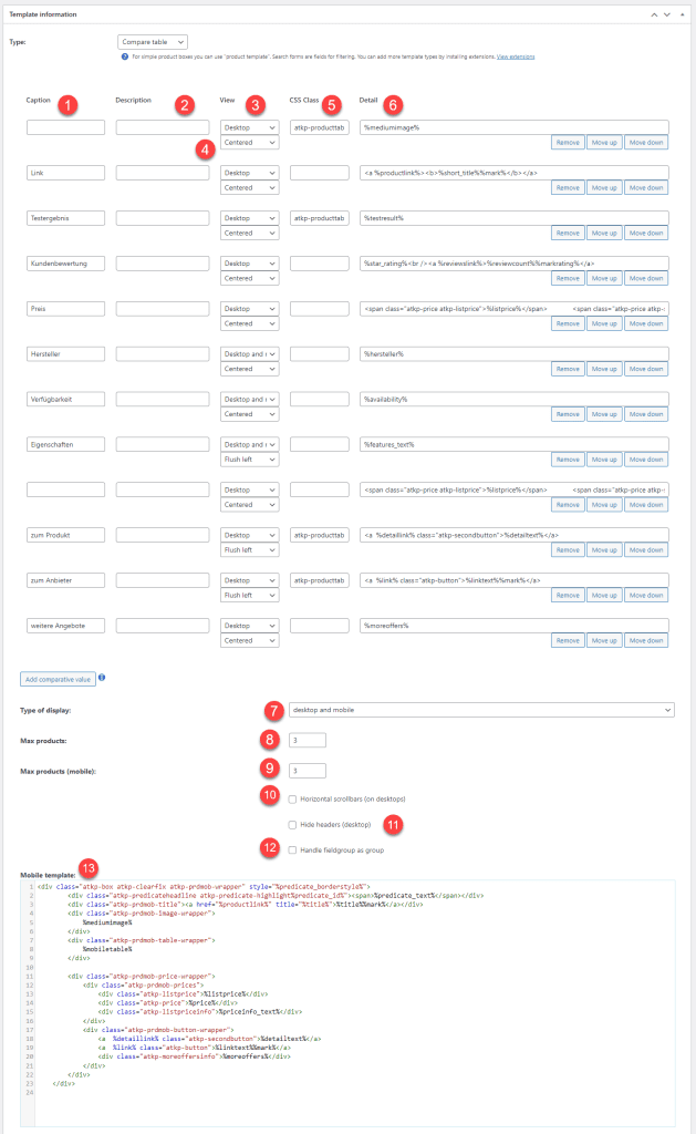
This is the column caption which is displayed in the header.
This description is displayed as soon as the user moves the mouse over the label. It is displayed as a tooltip.
This allows you to control whether this row is loaded in the "Desktop" comparison table or whether this row is loaded in the mobile table. If you select "Desktop and Mobile" it will be displayed in both cases.
This is the alignment of the value in the column.
You can also define your own CSS class which will be applied to the cell.
The placeholders are entered in this field. For example, %title% the title. You can define your own HTML before and after that.
If you enter the following value into this field, the user-defined fields from the field groups will be loaded at this point.
<!-AUTOROW->This controls whether the table should switch.
Here you can specify the maximum number of products that should appear next to each other. If the list contains more products than this number, they will simply not be displayed.
Here you can specify the maximum number of products that should appear below each other.
If you set the max. When the page width is reached, a scrollbar is automatically displayed.
This hides the column descriptions at the Destkop.
With this option, instead of listing the comparison values, the values are also divided into groups. This is recommended if you have a lot of comparative values and want to display them in a structured way.
In the field groups you can define this here:
The mobile template is displayed as a slimmed down table below each other.